Most AI analytics tools pass the demo beautifully. Then your team stops logging in by week three. It is not your team’s discipline. It is that the AI in most of these tools does not surface anything an experienced analyst would not spot in 20 minutes of manual review. I spent two years at Hansa Cequity running marketing intelligence for Westside, TataSky, and Titan Eye+, and another decade evaluating tools across retail, BFSI, and SaaS clients. Every tool I kept passed one test: does it change what you do next? This review applies it.
The AI Badge Is Doing More Work Than the AI
When most marketers evaluate AI analytics tools, they read the feature page. “AI-powered insights” goes in the pro column. “Predictive analytics” earns a checkmark. “Natural language query” sounds like a differentiator. Every item gets treated as equivalent evidence of capability. None of it is.
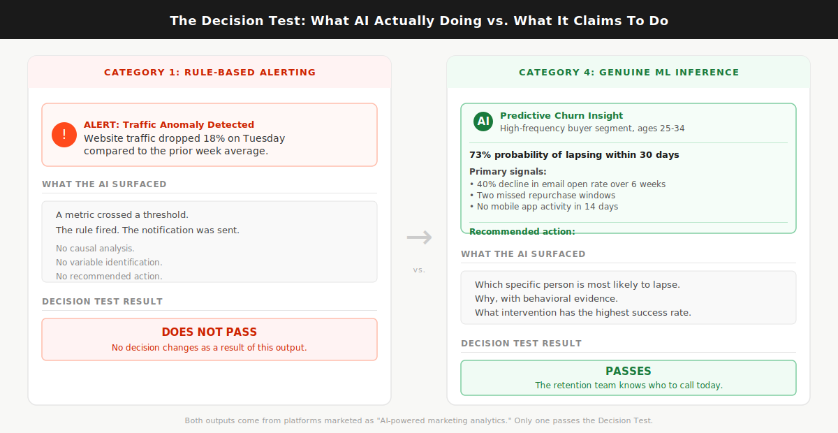
Here is what is actually happening inside these tools. Automated anomaly detection, the kind that fires a Slack alert when your Tuesday traffic drops 18%, is a rule. The rule says: if metric X crosses threshold Y, send notification Z. That logic has existed since the first marketing dashboard was built. Renaming it “AI-powered alerting” does not change what it does. Genuine AI inference synthesizes across multiple live data sources, identifies the causal chain behind a metric shift, and tells you which variable to act on. Almost every tool in this market does the first thing. Almost every tool markets itself as doing the second.
Most AI marketing analytics tools are dashboard upgrades with an AI badge, and buying one without applying the Decision Test first is how marketing teams end up with a beautiful tool nobody opens after month two.
The numbers confirm what practitioners already feel. The martech utilization rate dropped from 58% in 2020 to 33% in 2023, according to Gartner’s 2023 Marketing Technology Survey. That is not a story about teams who stopped caring about data. It is a story about tools that confirmed what those teams already knew, every single week, and asked them to log in to see more of the same. And AI adoption in marketing has not fixed it: 91% of marketers now actively use AI in their work, but only 41% can prove ROI, according to Jasper’s 2026 State of AI in Marketing report. The gap between adoption and proven return is the AI badge doing more work than the AI underneath it.
In client analytics work across retail and BFSI brands at Hansa Cequity, the most common complaint from marketing leads was not that the tools lacked data. It was that the alerts and dashboards told them what they already knew from reading their own weekly numbers. The tool was never the analyst. It was a display mechanism wearing an analyst’s job title.
Before evaluating any tool’s feature list, apply one filter first. Ask the sales team to walk you through the last three insights their AI surfaced for a client in your category and explain what decision each one changed. Not what the metric did. Not what the dashboard showed. What decision changed that would not have changed without the AI. If they cannot name a specific decision that changed, the AI is decorative.
The Decision Test: a pre-purchase filter that asks whether the tool’s AI surfaces an insight that changes your next action, or whether it repackages what you already see in a better-looking interface. Everything that follows applies that test.
What “AI-Powered” Actually Means Across These Tools
The phrase “AI-powered” covers four distinct capability types. Most tools have one or two of them. The badge does not tell you which.
Category 1 is rule-based alerting. The tool monitors your data against thresholds and fires notifications when something crosses a line. Useful for monitoring. Not intelligent in any meaningful sense. Every analytics platform built in the last decade includes this as a baseline feature, and it has never required machine learning to function.
Category 2 is automated reporting. The tool pulls from multiple data sources, formats data into dashboards or scheduled reports, and delivers them without manual assembly. Genuinely valuable for the hours it saves every week. The AI layer, where it exists, improves formatting and surfaces anomalies. No decision changes as a direct result.
Category 3 is natural language query. You type a question in plain English and the tool synthesizes an answer from your data. The quality range in this category is enormous. On some platforms the NLQ is a genuine inference engine: ask it something the product team never anticipated and it returns a synthesized answer from live, connected data. On others it is a decision tree wearing a chatbot costume. You will not know which you have until you ask a question nobody prepared for in the demo.
Category 4 is genuine ML inference. The tool builds models from your data and surfaces predictions, propensity scores, attribution weights, or churn probabilities that a human analyst could not derive at the same speed or across the same variable count. This is the only category that reliably passes the Decision Test.
For what it is worth: GA4 operates at Category 1 and 2, with some Category 3 features added in recent updates. Its AI-powered insight cards surface anomalies and suggest possible causes. Useful for monitoring. Not a substitute for attribution modeling or churn prediction. It does not pass the Decision Test as a primary analytics investment for any team past Stage 1 data maturity.
The Decision Test Applied: Four Categories, One Useful One
The standard evaluation process looks like this: pull a list of top-rated tools from a comparison article, book five demos, compare them on the same feature checklist, and choose the one whose dashboard looked best and whose sales rep followed up fastest. I have watched this process play out in rooms where the selected tool went completely unused six months later.
The reason it fails is category mismatch. A tool with 55 integrations, a polished interface, and an NLQ bar that only answers preset question types will score better than a tool with 12 integrations and a genuine churn prediction model on almost any standard feature comparison. More integrations. Cleaner design. Better demo. Wrong category for the actual job. Evaluating tools from different capability categories on the same feature matrix is like counting the buttons on a calculator and a spreadsheet to determine which one is more capable. You get a number. You learn nothing useful.
When I was evaluating analytics platforms for KoinX’s content and marketing stack, I asked one platform, marketed heavily on its AI insight capabilities, an unscripted question. I wanted to know which content clusters had driven the highest-intent traffic in the prior 90 days, split by new versus returning visitors. The answer I received was a ranked list of top pages by session count. The tool heard “which pages” and returned “most visited.” The question required synthesizing traffic quality signals across session behavior, not counting sessions. It could not do it. That is the gap between a genuine inference engine and a decision tree wearing a chatbot skin. That gap does not appear on any feature comparison table. It only shows up when you ask something the sales team did not prepare for.
By 2028, organizations combining multi-touch attribution, marketing mix modeling, and genuine ML inference are projected to outperform single-method organizations by 40% on marketing efficiency metrics, per Gartner’s integrated analytics research. That outperformance gap is not about using more tools. It is about using the right category of tool for the right job.
Assign every tool you are evaluating to a category before comparing anything else. Then ask only one question in every demo: show me an insight your AI surfaced in the last 30 days for a client in my sector that changed a specific decision they would not have made otherwise.
Category 4 is the only type that surfaces insights a human analyst would not have reached in the same time, at the same cost.
Here is the category reference you need before reading the tool verdicts:
- Category 1 (rule-based alerting): Notifies you when a metric crosses a preset threshold. Useful for monitoring. Present in virtually every analytics platform as a baseline feature. Does not pass the Decision Test.
- Category 2 (automated reporting): Consolidates multi-source data into formatted, scheduled reports and dashboards. Saves real analyst time every week. Does not pass the Decision Test on insight quality. Whatagraph and Databox operate here at their standard tiers.
- Category 3 (natural language query): Lets you ask questions of your data in plain English. Quality varies dramatically by platform. Passes the Decision Test only when the NLQ is a genuine inference engine rather than a preset query tree. Power BI Copilot with properly connected data is the clearest current example of a Category 3 that can pass.
- Category 4 (genuine ML inference): Builds predictive models, attribution weights, propensity scores, and churn probabilities from your data. Passes the Decision Test when correctly implemented on clean, connected data. Triple Whale and Northbeam for attribution, Akkio for prediction without a data science hire.
Read next: predictive analytics in marketing
The Tools That Pass (And What They Are Actually Best For)
Most comparison articles assign a “best for” label based on vendor positioning. “Best for agencies” means the reporting workflows match how agencies bill clients. It says nothing about whether the AI changes a campaign decision mid-flight. A tool can be excellent for agency reporting and useless for attribution. The label hides that distinction entirely.
Every tool below is reviewed against the Decision Test. One question: does the AI change what you do next?
PASS: Category 4 tools that change decisions.
Triple Whale. Built specifically for Shopify DTC brands running meaningful ad spend across Meta and Google. Its Total Impact Attribution model blends first-party pixel data with zero-party post-purchase survey responses to produce a revenue picture that corrects for what ad platforms over-report. After iOS 14 tracking changes, most DTC brands found their Meta data had been claiming significant credit for conversions that were partially or fully organic. Triple Whale measures actual incrementality by combining click attribution, survey attribution, and modeled attribution into a single revenue number that is more accurate than any single-method approach. Starts around $129/month for smaller Shopify stores, pricing scales by revenue tier. Decision Test result: passes for DTC attribution specifically. Does not pass for B2B, non-Shopify stores, or any business model where the customer journey runs through a sales cycle rather than a Shopify purchase flow.
Northbeam. The next tier up for multi-channel DTC brands where spend runs simultaneously across Meta, Google, TikTok, and offline channels. Where Triple Whale is primarily pixel-based, Northbeam layers in media mix modeling, which means it can attribute revenue to channels without a direct digital touchpoint. For brands where podcast sponsorship, direct mail, or connected TV is part of the media mix, Northbeam answers the attribution question those channels can never answer themselves. Pricing requires a demo conversation. Decision Test result: passes specifically for cross-channel budget reallocation decisions. If your primary question is which channel to scale and which to cut, this tool answers it more accurately than anything else at its tier.
Ruler Analytics. Built for B2B companies where revenue lives in the CRM, not the ad platform. It tracks anonymous visitors through the full funnel, connects them to CRM records at the moment of conversion, and attributes closed pipeline back to the original marketing touchpoint. For B2B SaaS and professional services teams, this answers the question most B2B marketers cannot currently answer from their existing stack: which channels are generating pipeline, not just form completions. The marketing attribution data makes the stakes visible: multi-touch attribution adoption has nearly doubled since 2023, but only 18% of those implementations are rated as highly accurate by the teams running them. Most of that accuracy gap traces to tool selection against business model. Ruler Analytics is built for the B2B model specifically. Starts around $199/month. Decision Test result: passes when the primary question is CRM-connected pipeline attribution. Does not pass for e-commerce or B2C contexts where the Shopify-based tools are better suited.
Power BI Copilot (with connected marketing data). The November 2025 Copilot update added a standalone interface that lets any user query any connected dataset in plain English and receive synthesized answers without SQL or configuration support. I tested it against a GA4 and CRM-connected dataset, asking which campaign types had produced the highest 90-day customer retention rates broken down by acquisition channel. It returned a correct synthesized answer with a supporting visualization in under 30 seconds. Decision Test result: passes when the underlying data is clean, fully connected, and consistent across sources. Fails when data is siloed or incomplete. The AI performs at exactly the level of the data foundation it sits on. For teams already in the Microsoft ecosystem with a working data layer in place, this is the lowest-friction path to genuine Category 3 capability currently available.
Akkio. A predictive modeling platform designed for marketing analysts who need ML outputs without a data science hire. Upload historical data, specify what you want to predict (conversion probability, churn risk, lead quality score), and Akkio trains and returns a working model in minutes. Model training time runs from a few seconds to five minutes depending on dataset size. Starts around $49/month. Decision Test result: passes for propensity modeling and churn scoring. For teams that want to rank a lead list by conversion probability before handing it to sales, or identify which customers are most likely to lapse before the next repurchase window, this is the lowest-cost entry point into genuine Category 4 capability currently in the market.
PARTIAL PASS: Category 2 and 3 tools that save time without reliably changing decisions.
Whatagraph. The clearest example in this market of a tool that does its actual job well and is marketed beyond it. For agencies managing multi-client reporting across multiple channels, it is the strongest option at its price point: 55-plus data source connections that stay active without maintenance, pre-built report templates, and automated scheduling that removes weekly manual assembly. The AI layer surfaces anomalies and highlights metric changes. That is Category 1 alerting in a polished interface. Decision Test result: does not pass on insight quality. Does pass on reporting efficiency. Worth the investment if your team spends more than three hours a week building reports manually. The wrong tool if what you actually need is attribution clarity or predictive modeling.
Databox. A centralized KPI dashboard with broad integrations, automated alerts, and a low technical barrier. Clean interface. Genuinely useful for teams that want a single screen showing all key metrics without logging into five platforms. The AI features operate at Category 1 and 2. Decision Test result: does not pass. Worth it for visibility and reporting speed. Not worth it if you are purchasing it expecting predictive intelligence.
DOES NOT PASS for most growth-stage teams.
Salesforce Marketing Cloud Intelligence and Adobe Analytics. The decision logic for both is identical, so I am addressing them together. Both have genuine Category 4 capability. The ML models are sophisticated. The attribution is multi-touch. The predictive outputs are meaningful when implementation is complete. The problem is what “complete implementation” actually requires. Below roughly $50 million in annual revenue, or without a dedicated data engineering function that can sustain the platform infrastructure, most teams using these platforms operate them as expensive Category 2 tools. The AI layer requires data architecture depth that takes months to build and a technical team to maintain. Decision Test result: passes at enterprise scale with the right team. Does not pass for the growth-stage marketing team reading this article.
Here is what Category 4 looks like in practice, from a context where the stakes were real. During Hansa Cequity’s customer intelligence work for TataSky across 12 million subscriber records, the tools that changed decisions were never the dashboards. They were the propensity model outputs that told the retention team which specific subscriber was most likely to lapse in the next 30 days, the behavioral signals driving that probability, and which historical intervention had the highest success rate for that subscriber profile. The retention team acted on model outputs, not on a dashboard flagging that churn was trending upward across a segment. If the AI tells you something is happening to a metric, that is Category 1 or 2. If it tells you which specific person is most likely to do something next, with a probability score and the behavioral variables behind it, that is Category 4. The retention rate difference between those two types of intelligence is not a feature comparison. It is whether you act before the churn or after it.
Here is the full shortlist in a single reference:
Match the tool to the job. An attribution tool answers “which channel is generating actual revenue.” A predictive tool answers “which customer is most likely to convert or churn.” An NLQ tool answers “I want to ask questions of my data without writing SQL.” A reporting tool answers “I need to stop spending hours building the same report manually.” Buying a reporting tool and expecting it to answer attribution questions is the most common mismatch in this category.
A Note on Pricing Transparency
Most of the PASS-category tools will not give you a number until you book a demo. Sometimes this is legitimate: platforms priced by Shopify revenue tier, data volume, or channel count genuinely cannot quote without knowing your specifics. Sometimes it is a sales process designed to create attachment before you know the cost. Both exist in this market, and the demo process does not tell you which you are dealing with.
Here is how to compress the qualification time. Before booking any demo, send one brief email: “We are in early evaluation. Can you give us a ballpark monthly cost for a company at [your revenue tier] with [your channel count]?” About half of well-run sales teams will give you a range. The teams that refuse entirely are telling you something accurate about how they operate post-sale.
For tools with published starting prices, run a trial against your own data before speaking to anyone. Akkio at around $49/month, Ruler Analytics at around $199/month, and Triple Whale at around $129/month can all be evaluated against real data before entering a sales conversation. Start there before booking anything else.
The Stack Question and Who Should Wait
Most buyers searching for an AI marketing analytics tool want one platform that handles everything: attribution, prediction, NLQ, and automated reporting from a single vendor. Every enterprise-tier vendor leads with exactly this pitch. It is a convincing demo. It is almost never the right purchase for a team under 100 people.
The best attribution tool in this market is not the best reporting tool. The best predictive modeling platform is not the best multi-channel dashboard. Vendors who claim to do all four things well are typically excellent at one and adequate at the other three. A two-tool stack, one purpose-built for attribution and one for reporting, consistently outperforms any all-in-one platform below the enterprise tier. At lower cost. With lower implementation complexity. With faster time to first useful output.
Across advisory work with companies including KoinX, every analytics stack conversation started with the same question: what is the one decision you cannot currently make with confidence? When the answer was “we do not know which channel is generating actual revenue versus which one is claiming credit for organic intent,” the right tool was an attribution platform. When the answer was “we spend three hours a week rebuilding the same report,” the right tool was a reporting automation platform. When the answer was “we do not know which customers are going to lapse before they tell us,” the right tool was a predictive model. It was never one platform solving all three. The teams that bought a single all-in-one platform to solve all three problems consistently solved none of them well.
Companies consolidating around purpose-fit AI tools report 50 to 77% cost reductions compared to sprawling, overlapping stacks, according to ALM Corp’s 2026 martech research. But that consolidation story applies to over-tooled teams running 10 or 15 platforms with low utilization across all of them. If you are currently on GA4 and a spreadsheet, the consolidation argument does not apply to you. You are not over-tooled. You are under-tooled. The answer is to add one specific tool that closes one specific decision gap.
Start with one tool solving one job. Every time.
Here is the three-stage maturity filter:
Stage 1: Your data is fragmented. GA4, your ad platforms, your CRM, and your email tool do not report into a single view. Reports require manual exports and spreadsheet stitching every week to produce. Do not invest in an AI analytics tool yet. No AI layer performs reliably on disconnected data. The right investment at Stage 1 is connecting your data sources into a single view, not buying intelligence to sit on top of broken infrastructure. That data layer is not a glamorous investment. It is the prerequisite for every tool in this article.
Stage 2: Your data is consolidated, but you are spending three or more hours a week building the same reports by hand. The right investment is a Category 2 reporting tool: Whatagraph for agencies managing multiple client accounts, Databox for internal teams that need a single performance screen. This frees analyst time and creates the operational foundation that makes a Category 4 tool worth having.
Stage 3: Reporting is automated. Your team is asking questions that manual analysis cannot answer at speed: which customers are most likely to convert in the next 30 days, which channel is generating actual pipeline rather than claiming credit for organic intent, which audience segment is showing early attrition signals before the churn shows up in the numbers. This is where a Category 4 tool belongs. If the decision gap is attribution: Triple Whale for DTC, Northbeam for multi-channel DTC with offline spend, Ruler Analytics for B2B. If the decision gap is prediction: Akkio for most growth-stage teams, enterprise platforms for teams with the data infrastructure to support them.
If you skipped Stages 1 and 2 and bought a Stage 3 tool, you already know the result. The AI surfaced noise. The team stopped logging in. The license renewed and nobody noticed until the annual review. That is not a reason to write off AI analytics. It is a reason to fix the foundation before the tool can do what you paid for.
Here is how to run this process and get to a decision in under three weeks.
- Write down the one decision you cannot currently make with confidence, in one sentence, before you open any vendor website. “We cannot determine which channel is generating actual revenue” or “We cannot identify which customers are most likely to lapse before they tell us.” One decision. One sentence. This determines your category before you look at a single feature list.
- Map that decision to a category using the framework in this article. Attribution questions need Category 4 attribution tools. Churn and conversion prediction needs Category 4 predictive tools. Reporting speed needs Category 2. If your answer maps to Category 1, you do not need to purchase anything. GA4 already does that.
- Apply the Decision Test in every demo before the call ends. Ask the sales team to name three insights their AI surfaced for clients in your sector in the last 90 days and what specific decision each one changed. Not which metric moved. What decision changed that would not have changed without the AI. If they cannot produce three concrete examples from real client accounts, you are evaluating a Category 1 or 2 tool positioned as Category 4.
- Check your data foundation before signing any contract. Answer honestly: do all your key data sources currently report into one place without manual intervention? If the answer is no, fix that first. No tool in this article will deliver on its Decision Test promise sitting on fragmented data.
- At the 90-day mark after implementation, apply the Decision Test to your own usage. Name three insights the AI surfaced that changed a decision you would not have made otherwise. If you cannot name three, you either selected the wrong tool, are on the wrong pricing tier, or need to fix the data foundation before the AI layer can work. Any of those is a solvable problem. Renewing the license without diagnosing which one is not.
If you want a second opinion on which tool fits your specific stack and growth stage, reach me at shankar@shno.co.